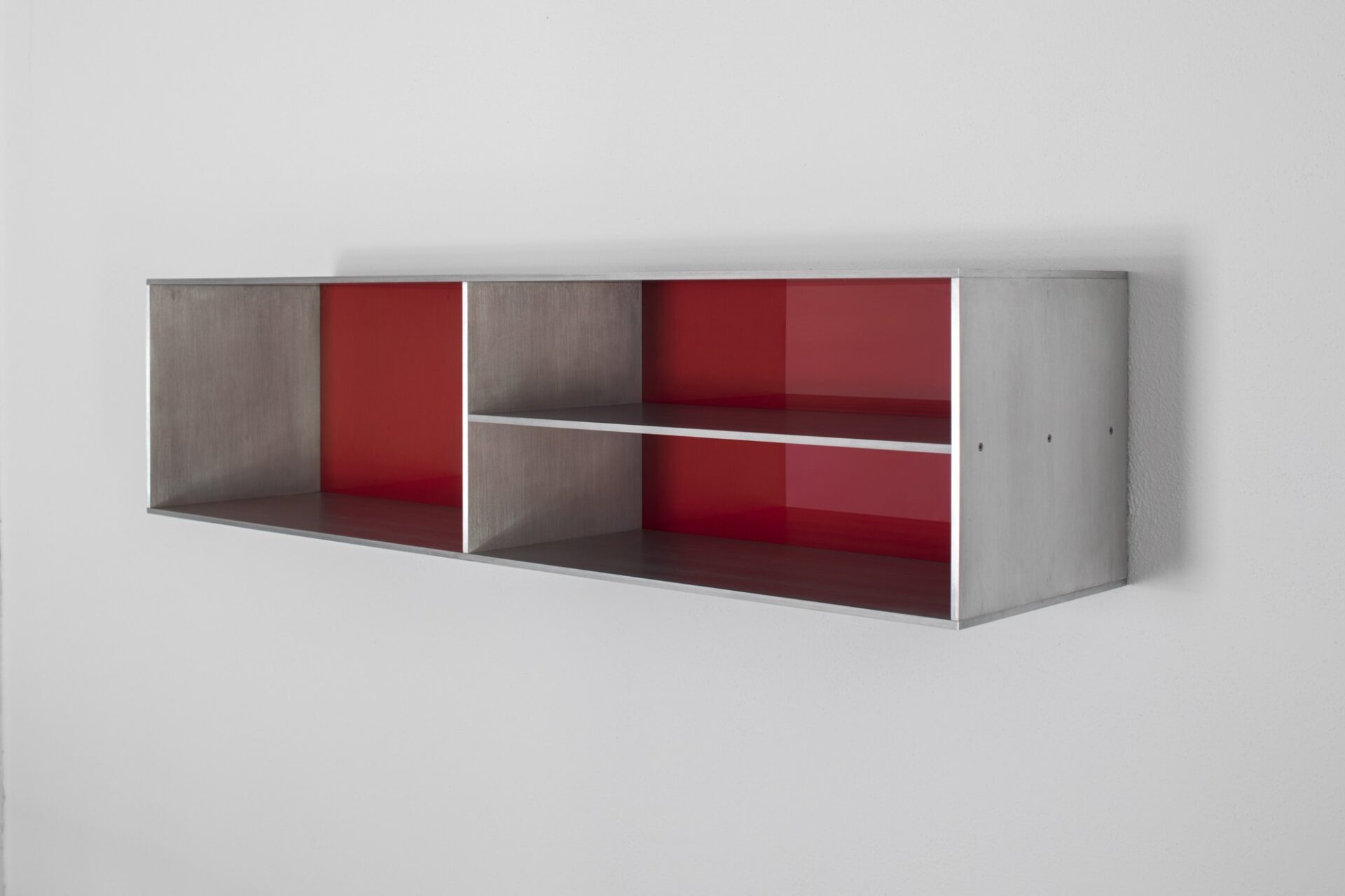
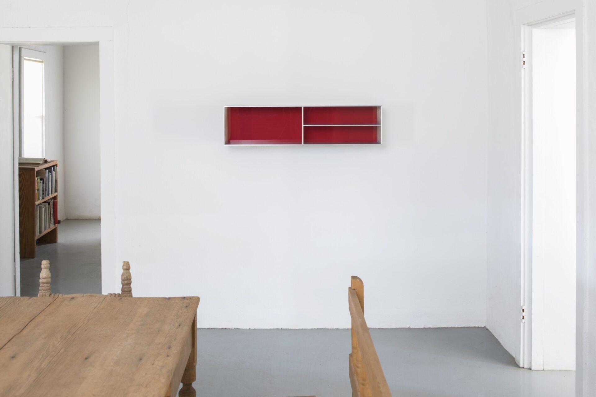
This work is installed on the wall slightly below the average sightline; according to Donald Judd, “The viewer is meant to see a little of the tops of the boxes. . . . to avoid flattening [them] when they are on the wall. If the viewer can see a little of the top plane it’s going to keep them three-dimensional.”1
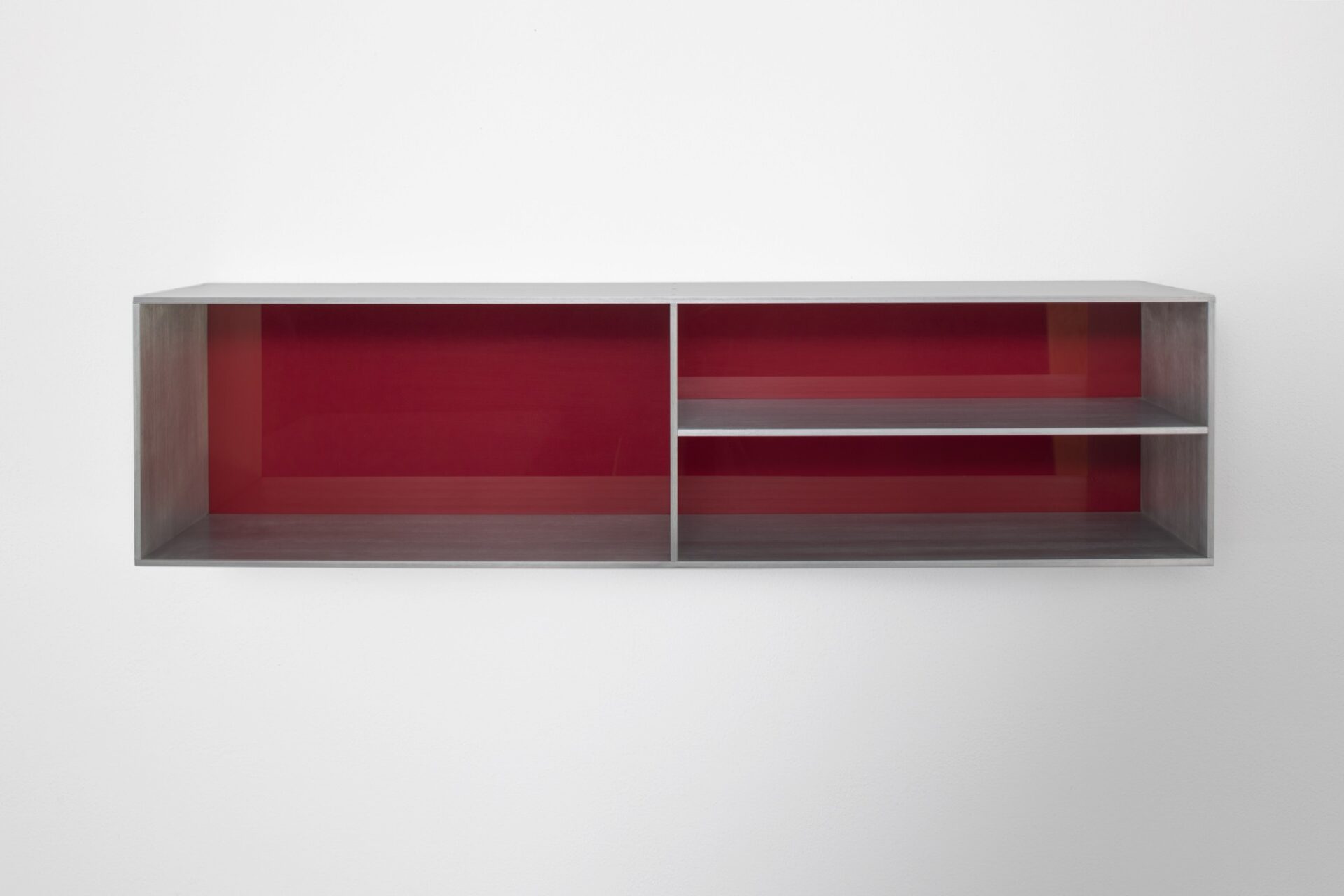
In this piece, Judd used the simple and readily visible proportion of 1:2 in two instances: the work is bisected by a vertical plate of aluminum, creating what would have been two mirror-image halves, if not for the further bisecting of the right half of the piece through the addition of a horizontal plate of aluminum.
Judd described his thinking on proportion in a 1992 interview for Kunst und Kirche magazine:
My idea of proportion is simpler than [something like the golden section], although it’s rather complicated to explain. My first work was developed by looking. Then I figured out many things were very close to even proportions. And slowly I made the proportions even. I think what you see are just the simple ones, 1:2 and 2:3 and 3:4, not Palladio’s elaborate proportions but Alberti’s simple ones as in the cathedral in Mantua. An example of that is one of Frank Lloyd Wright’s cheap houses. I was once asked to dinner and the minute I went in I felt that it was dignified. It wasn’t big, it was rather small. But the spaces were good. . . . The main quality is “dignity,” which is in very short supply in our days.2


